WIRED.com has merged into one WordPress install:
Our redesign is here thanks to a big under-the-radar project in March 2014, when we migrated 17 active WIRED blogs into a single WordPress install. If we did our jobs right, you barely noticed that happen.
No doubt that this was a big job. Good to see it all come together, making their content easier to manage.
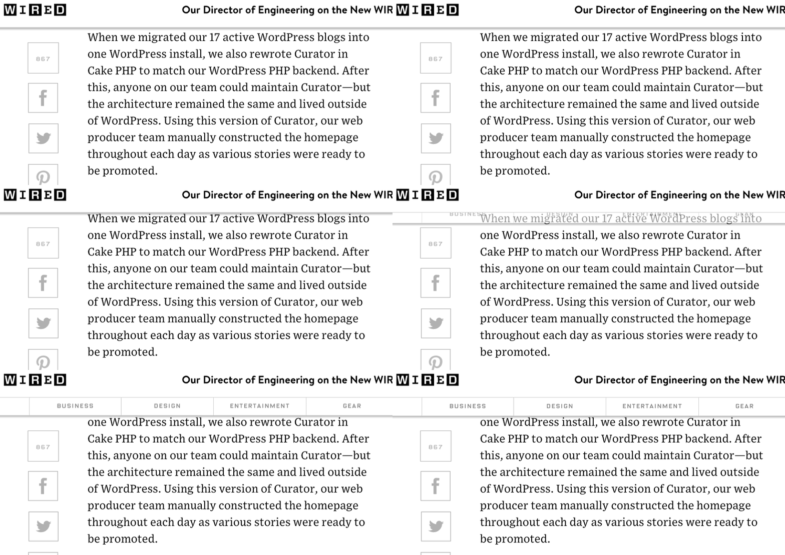
Unfortunately their new design includes the super annoying trend of covering up the text I was reading when I scroll up on the site:
This makes the reading experience really painful.

2 replies on “WIRED on WordPress”
😉
Sounds good, first step is to stop covering up the text I’m reading when I scroll 🙂